No products in the cart.
Return To Shop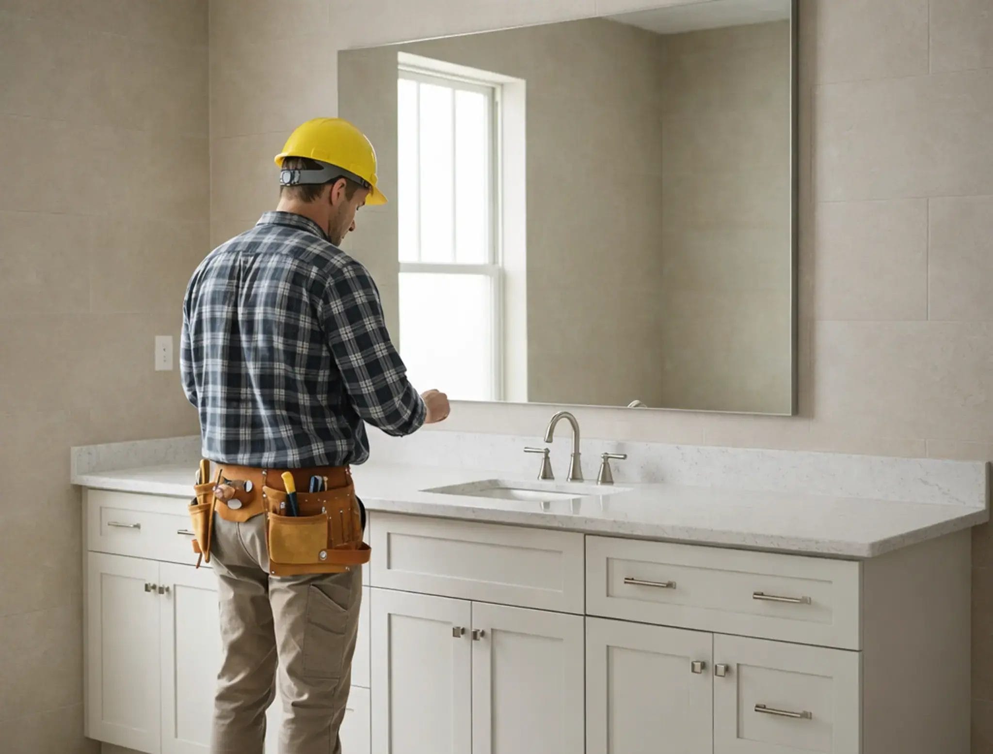


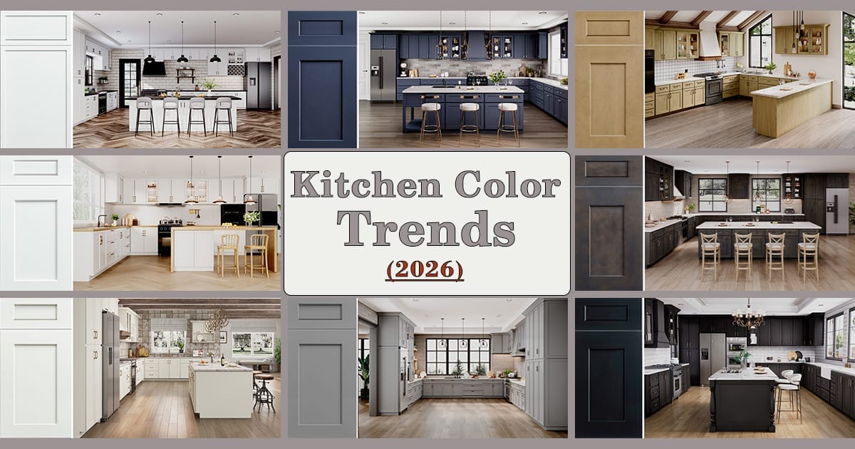
Kitchen Color Trends for 2026
I’ve been designing kitchens for over 20 years, and if there’s one thing I’ve learned, it’s that color matters — not just for aesthetics, but for how you live in your kitchen every single day. For many homemakers, the struggle is real: you want something beautiful and current, but you also need durable, easy-to-clean surfaces that won’t feel dated in a few years. Check out the top 5 kitchen cabinet colors for 2025 for inspiration.
In 2026, the kitchen color trends lean toward warmth, nature, and maturity — trends you can absolutely bring into your home without going over the top.
Table of Contents
Why Kitchen Color Trends Matter (2026)
- Mood & Ambiance: The right palette can make your kitchen feel calming, bright, or dramatic — depending on what your family needs.
- Longevity: Colors that feel too trendy may feel stale after a few years. As a designer, I always wrestle with helping clients pick something fresh but timeless.
- Practicality: Bold or light colors look great until the kids’ fingerprints and cooking splatters get to them. So durability, maintenance, and how color hides (or doesn’t hide) wear are essential.
2026 Color Trends at a Glance

Here’s the big picture: 2026 is all about natural inspiration + warm neutrals + mature statement colors. According to the NKBA (National Kitchen & Bath Association), neutrals still dominate (96% of surveyed designers/homeowners), with greens (86%) and blues (78%) not far behind.
Rather than splashy or bright tones, statement colors are showing up selectively — on islands, backsplashes, wallpaper, or decorative accents.
There’s also a strong push toward natural materials — wood grain is on the rise, and quartzite counters and backsplashes are increasingly popular.
In design style, “timeless / transitional” kitchens remain a favorite (72% of respondents), followed by modern-minimalist (60%) and organic-natural (58%).
Top Trend Picks
Here are the major color trends I’m seeing (and recommending) right now, especially in ways that feel grounded, usable, and emotionally warm for a family kitchen.
1. Earthy Neutrals (warm beige, clay, olive)

- Think warm beige, mushroom, taupe, clay, and olive green.
- These create a calm, natural, and inviting atmosphere.
- They pair beautifully with wood finishes, stone countertops, and soft metallics like brushed brass.
- Why it works for the everyday cook: neutrals hide wear better, feel timeless, and integrate easily with both natural and modern textures.
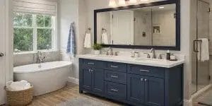
2. Moody Colors (midnight blue, forest green)

- Rich tones like midnight blue, forest green, and even deep terracotta are trending.
- These shades offer drama and sophistication without being flashy. They work especially well in two-tone kitchens (dark lowers, lighter uppers) or on an island.
- Practical tip: Use them as accents if your kitchen doesn’t have a ton of natural light — balance with lighter surfaces and good lighting.
3. Tone-on-Tone & Monochrome

- These are “neutrals” that feel more deliberate: deep greys, smoky hues, or even muted greens or blues.
- Homeowners are increasingly drawn to the idea of a tone-on-tone or monochromatic kitchen design — for example, uppers, lowers, and the island in slightly different shades of the same family.
- This trend offers cohesion and calm, while still allowing for richness.
4. Soft Pastels (sage, powder blue)

- Shades like sage green, dusty lavender, or powder blue are showing up more in 2026.
- These hues bring a gentle dash of color without feeling too “on trend.”
- When paired with natural wood, matte stone, or soft metallic hardware, they feel fresh, homey, and balanced.
5. Two-Tone Layering

- Rather than high-contrast pairings (like stark white + navy), more homeowners are embracing layered, tonal contrast: for instance, a darker base cabinet with a lighter upper or island.
- This creates visual depth, defines different areas of the kitchen, and brings design interest without feeling overly bold or risky.
Which Color Works for Your Kitchen (quick guide)
Here’s how you can apply these trends in a real, lived‑in kitchen — especially if you’re doing a renovation or just trying to refresh.
| Kitchen Scenario | Color Strategy (2026‑Friendly) |
|---|---|
| Small or Low-Light Kitchen | Use warm neutrals (like creamy beige or olive) to brighten and open up the space. Consider tone-on-tone or two-tone designs to avoid monotony. |
| Large or Open-Plan Kitchen | Experiment with moody hues (midnight blue, forest green) on your island or base cabinets, paired with lighter uppers or wood for balance. |
| Tight Budget / DIY Project | Repaint existing cabinets with a trendy-but-timeless color rather than replacing them. A two-tone approach helps define zones without a full overhaul. |
| Long-Term Durability & Style | Pair these 2026 trend colors with durable hardware (brushed brass, black), natural materials (oak, quartzite), and soft, warm lighting to create a kitchen that ages well. |
Practical Maintenance Tips
- Dark Cabinets (moody blues, deep greens): These hide grime well, but fingerprints and smudges can show. Use a soft microfiber cloth and a gentle cleaner — avoid abrasive scrubs.
- Light Cabinets (creamy neutrals, pastels): These can scuff or stain more easily. Choose high-quality, scrubbable paint finishes. Consider a protective wax or touch-up kit if available.
- Two-Tone Layouts: One of the best “cheats” for disguise — if mess accumulates in one zone (like the base cabinets), the contrast helps visually mask it, making the overall space feel more relaxed.
Real Family Case: Sage + Cream Success
A few years ago, I worked with a busy family who was terrified of choosing anything too colorful. They had two young kids, and cleaning was never “just once a week.” They worried that bold colors would feel trendy or messy, but they also didn’t want another all-white kitchen.
We landed on a two-tone design: sage green lower cabinets + creamy upper cabinets + brushed brass hardware + a soft white quartz countertop. The result: their kitchen feels warm and grounded, but it’s not bland. The sage green hides smudges better than white, and the cream keeps the space bright. They told me it’s now their favorite room in the house for morning coffee and family breakfasts.
Designer Takeaway: Balance Style and Durability
After two decades in this business, one thing I keep telling my clients — especially homemakers — is: don’t chase “the loudest trend.” Trends come and go, but your kitchen is something you’ll use daily for years. The 2026 palette hits a sweet spot: it’s connected to nature, emotionally warm, and thoughtfully expressive, without being over-the-top.
Yes, there’s pressure (“what if I pick wrong?”), but there’s also opportunity — to pick wisely, in a way that balances taste, function, and longevity.
Quick Action Steps (swatches, test, ask pro)
- Order paint swatches or cabinet door samples in a few trend-aligned colors (sage, deep blue, warm beige) and live with them for a week so you can see how they look in your light.
- Test a two-tone design on a small zone — maybe just the island or the lower cabinets. If it feels right, you can expand.
- Talk to your designer or contractor about maintenance: what paint finish, what hardware, and how to protect your cabinets long-term.
- Blend material textures: mix in wood, stone, or soft metallics to give personality and balance to your cabinetry color.


Related posts
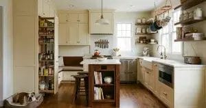
Although the kitchen is often only a few square meters in size, it carries an enormous responsibility in daily life. It supports three meals a... Continue reading
Bathroom renovations often look simple on paper, yet anyone who has gone through one knows how many small decisions quietly affect daily comfort for years.... Continue reading

I’ve designed more laundry rooms than I can count, and if there’s one thing I’ve learned, it’s this:a poorly planned laundry room will frustrate you... Continue reading

Choosing the right bathroom vanity can feel overwhelming—trust me, you’re not alone! In the United States, there’s no one-size-fits-all solution. Your perfect vanity depends on... Continue reading

I was camping in CS2 when a kitchen scene stopped me in my tracks — it looked exactly like a European farmhouse I’d seen in... Continue reading


Add comment