No products in the cart.
Return To Shop.png?sharp=1)
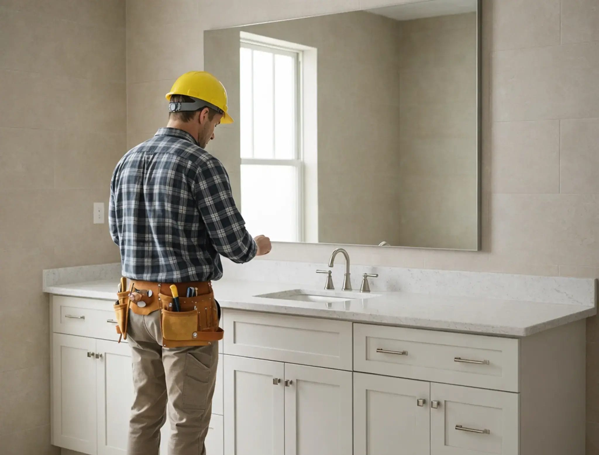



How Should You Choose Bathroom Colors in 2026
Bathroom color trends in 2026 are moving toward warmer, more natural palettes rather than stark white and cool gray alone. Light neutrals remain the safest foundation, but warm off-whites, beige, tan, sage green, olive, and natural wood tones are becoming more important in bathroom walls, flooring, and vanities.
According to the NKBA 2026 Bath Trends Report, 96% of design professionals expect neutrals to remain the leading bathroom color family. Off-white, light brown or tan, and white rank among the strongest neutral choices, while sage and olive lead the green category.
The best bathroom color is still the one that works with your room size, natural light, flooring, fixtures, and vanity finish. This guide explains which 2026 colors are trending, where to use them, and which combinations are easier to live with long term.
2026 Bathroom Color Trends at a Glance
| Color Direction | Best Used For | Works Well With |
|---|---|---|
| Warm White & Off-White | Walls, tile, small bathrooms | Light wood, walnut, black or brushed metal |
| Beige & Light Tan | Walls, flooring, warm neutral bathrooms | White, oak, walnut, cream |
| Sage Green | Vanity, accent wall, tile | Warm white, natural wood, brass or black |
| Olive Green | Vanity or deeper accent areas | Cream, beige, walnut, stone |
| Light Wood Tones | Bathroom vanities | White, greige, sage, stone |
| Dark Brown / Charcoal Accents | Hardware, vanity accents, larger bathrooms | Warm neutrals and natural stone |
For most bathrooms, use one light neutral as the main color and add stronger tones through the vanity, tile, hardware, or smaller accent areas. This makes it easier to update the room later without replacing every finish.
Table of Contents
- 2026 Bathroom Color Trends at a Glance
- Warm Whites and Off-Whites
- Beige, Tan and Warm Neutrals
- Sage and Olive Green
- How to Use Gray in a 2026 Bathroom
- Should You Use Dark Colors in a Bathroom?
- Bathroom Vanity Color Trends for 2026
- How to Match Vanity, Wall and Floor Colors
- Bathroom Color Ideas by Room Size and Lighting
- Frequently Asked Questions
Warm Whites and Off-Whites
Warm white and off-white remain some of the easiest bathroom colors to use in 2026. They keep the room bright without creating the colder look that can come from a very stark white, and they work well with natural wood, beige, stone, brushed metal, and darker hardware.
For smaller bathrooms or rooms with limited daylight, a warm white can work especially well on walls or large tile surfaces because it keeps the background light while allowing the vanity, flooring, and fixtures to provide contrast.

A common layout uses white wall tiles with light gray slip resistant floor tiles. Bathroom fixtures including toilets bathtubs shower enclosures hardware and bathroom vanities should remain within the same light color family. This creates a unified appearance and helps the room feel larger and more orderly. Tiles with subtle texture or matte finishes can add visual depth without overwhelming the space.
In larger primary bathrooms white can serve as the dominant color while gray is used for accents or flooring. Pairing this scheme with a wall mounted bathroom vanity improves daily cleaning and allows more of the floor to remain visible which enhances the sense of openness. This approach continues to be a preferred choice in many American homes.
Sage and Olive Green
Sage and olive are two of the strongest green directions for bathrooms in 2026. Compared with brighter greens, these muted, brown-based tones are easier to combine with warm white, beige, natural stone, oak, walnut, and brushed or matte metal finishes.
Sage works especially well when you want a softer, lighter bathroom. It can be used on a vanity, accent wall, or selected tile without making the room feel overly colorful.
Olive creates a deeper, warmer look and works particularly well with cream, beige, walnut, and light stone. In smaller bathrooms, use olive more selectively so the room still feels open and balanced.
NKBA’s 2026 report specifically identifies sage and olive as the leading green shades, well ahead of bolder greens such as teal or emerald.
Where to Use Sage or Olive in a Bathroom
- Use sage on a vanity when you want color without making the bathroom feel dark.
- Pair olive cabinetry with warm white or beige walls to keep enough visual contrast.
- Use green tile as an accent rather than covering every surface if the bathroom is small.
- Compare the cabinet or tile sample under the actual bathroom lighting before making the final choice.
How to Use Gray in a 2026 Bathroom
Gray is still useful in bathroom design, but in 2026 it works better as a supporting neutral than as the only color throughout the room. Softer greige, warm gray, and stone-inspired gray are generally easier to combine with the warmer whites, tans, greens, and wood tones that are becoming more important.
Avoid using the same cool gray tone on the walls, floor, vanity, and tile. This can make the bathroom feel flat or colder than intended. Instead, use gray to create contrast between warmer surfaces.
For example, a warm white wall can work with a soft gray floor and a natural wood vanity, or a light greige tile can be paired with sage cabinetry and darker hardware.
When Gray Still Works Well
- As a light floor or stone-look tile paired with warmer walls.
- As a greige or warm-gray background behind natural wood cabinetry.
- As a darker accent in hardware, tile details, or selected surfaces rather than the entire bathroom.
Planning tip: If your existing bathroom already has gray tile, you do not need to replace it simply because warmer colors are trending. Add warmth through the vanity, wall color, wood tones, lighting, or accessories instead.
Beige, Tan and Warm Neutrals
Beige, tan, cream, and other warm neutrals are becoming more important in 2026 bathroom palettes. They create a softer transition between white fixtures, natural stone, wood vanities, and warm metal finishes than cool gray often does.
Light beige or tan works particularly well on flooring, wall tile, or larger background surfaces. These colors can add warmth without making the bathroom feel dark, which makes them useful for both compact bathrooms and larger primary bathrooms.
When using warm neutrals, avoid choosing every surface in nearly the same shade. A better approach is to vary the lightness and material: for example, warm white walls, a light tan floor, and a natural wood vanity. This keeps the palette coordinated while still giving each surface enough visual separation.
Should You Use Dark Colors in a Bathroom?
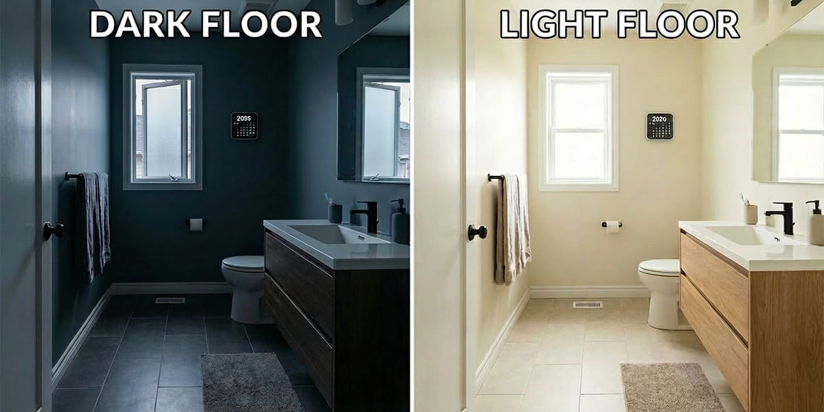
Dark colors can work well in a bathroom, but they need to be balanced with the room’s size, lighting, and surrounding finishes. Deep brown, charcoal, black, and dark wood tones can add contrast and depth, especially when they are paired with lighter walls, countertops, or tile.
In a small bathroom or a room with limited natural light, using dark colors across the floor, walls, and vanity at the same time can make the space feel visually heavier. A safer approach is to keep the larger surfaces relatively light and use darker tones selectively through the vanity, hardware, floor accents, or one feature area.
In a larger primary bathroom with good lighting, darker colors are easier to use in larger amounts. A walnut or dark brown vanity, for example, can create a strong focal point when paired with warm white walls, light stone, or beige flooring.
How to Use Dark Bathroom Colors Without Making the Room Feel Heavy
- Use dark colors on one major element, such as the vanity or floor, instead of making every surface dark.
- Pair dark cabinetry with warm white, beige, cream, or light stone to create visual separation.
- Check the color under the bathroom’s actual lighting before ordering cabinets, tile, or paint.
- In smaller bathrooms, use darker tones as accents and keep larger surfaces lighter when you want the room to feel more open.
Planning tip: If you are considering a dark vanity, compare the sample against the actual wall tile, flooring, countertop, and bathroom lighting. Dark brown, walnut, charcoal, and black can look very different under warm and cool artificial light.
Terrazzo offers controlled variation without sacrificing practicality
Terrazzo and patterned surfaces can add personality to a bathroom while keeping the overall color palette controlled. Instead of treating terrazzo as the main trend, use it as a supporting element that connects colors from the walls, floor, vanity, and fixtures.

When choosing terrazzo or patterned tile, look at the background color and accent colors together. A terrazzo surface with warm beige, cream, or light gray tones can work well with 2026 bathroom palettes such as warm whites, natural wood, sage green, and soft neutrals.
How to Balance Patterned Bathroom Surfaces
- Use patterned flooring with simpler wall colors to avoid visual overload.
- Match the vanity color with one of the softer tones found in the tile pattern.
- In smaller bathrooms, keep large surfaces lighter and use patterns as accents.
- Always compare tile samples with cabinet and countertop finishes before finalizing the design.
Bathroom Vanity Color Trends for 2026
Bathroom vanities are becoming one of the main places to introduce warmth and natural color in 2026. Rather than matching the vanity exactly to the wall or floor, many bathrooms use the vanity as a contrasting focal point while keeping the larger surfaces lighter and more neutral.
Natural wood finishes are especially important. NKBA’s 2026 Bath Trends Report found that wood-faced vanities are expected to be more popular than painted vanities, reflecting the broader shift toward organic and nature-inspired bathroom design.
Most Useful Vanity Color Directions for 2026
- Choose the wall and floor colors before comparing vanity finishes.
- Keep enough contrast between the vanity and surrounding surfaces so the cabinetry does not visually disappear into the room.
- Compare cabinet samples under the bathroom’s actual natural and artificial lighting.
- If the floor or wall already has strong veining or pattern, choose a simpler vanity finish rather than adding another competing pattern.
A simple approach is to use one light neutral for the largest surfaces and let the vanity provide the main contrast. For example, warm white walls with beige flooring can work with oak, walnut, sage, or soft gray cabinetry without making the bathroom feel overly coordinated.
If you are comparing vanity finishes, reviewing a physical cabinet sample can help you see how the color changes next to your tile, countertop, and bathroom lighting before you make a final decision.
How to Match Vanity, Wall and Floor Colors
A balanced bathroom color scheme does not require the vanity, walls, and floor to match exactly. In most cases, the room looks more intentional when one surface acts as the main background, one provides contrast, and the remaining finishes connect the two.
Start with the least flexible finish first. If the flooring or tile is already installed, use it as the starting point and choose the wall and vanity colors around it. For a new remodel, select the vanity, countertop, wall tile, and flooring together so you can compare their undertones before ordering.
| Vanity Color | Wall Color | Floor Color | Overall Effect |
|---|---|---|---|
| Warm White | Beige, greige, or soft white | Light tan or stone | Bright and warm |
| Light Oak | Warm white or cream | Beige, greige, or light stone | Natural and airy |
| Walnut | Warm white or light beige | Light stone or soft gray | Strong contrast and warmth |
| Sage Green | Warm white or cream | Beige or light natural stone | Soft color with an organic feel |
| Olive Green | Cream or light beige | Warm stone or light tan | Deeper and more dramatic |
| Soft Gray / Greige | Warm white or beige | Light wood-look or stone | Neutral without feeling too cool |
Choose Contrast Instead of Exact Color Matching
If the vanity and wall are almost the same color, the cabinetry can visually disappear into the room. A small amount of contrast usually makes the vanity easier to see and helps the bathroom feel more layered.
For example, a white vanity can stand out better against a warm beige or greige wall than against another nearly identical white. Likewise, walnut cabinetry is easier to balance when the surrounding wall and floor surfaces remain lighter.
Check the Undertones Before Ordering
Two colors can both be described as “white,” “gray,” or “beige” and still look wrong together because their undertones are different. A cool blue-gray floor may clash with a yellow-based cream wall, while a warm greige can coordinate more naturally with oak, walnut, beige, or sage.
Planning tip: Compare cabinet, countertop, tile, and paint samples together in the actual bathroom. Check them in both daylight and the artificial lighting you plan to use, because the same finish can appear warmer or cooler under different light sources.
Bathroom Color Ideas by Room Size and Lighting
Bathroom colors can look very different depending on the size of the room and the amount of natural light. A color that feels soft and balanced in a bright primary bathroom may appear much darker or cooler in a small bathroom with no windows.
Small Bathrooms or Powder Rooms
In a small bathroom, keep the largest surfaces relatively light if you want the room to feel more open. Warm white, off-white, light beige, greige, and pale sage can work well on walls or tile while allowing the vanity or hardware to provide stronger contrast.
- Use a lighter wall color when the room has little natural light.
- Introduce deeper colors through the vanity, mirror frame, hardware, or smaller tile areas.
- Avoid using nearly identical colors on the wall, floor, and vanity because the room can look flat rather than larger.
Bathrooms With Limited Natural Light
Bathrooms without windows or with limited daylight depend heavily on artificial lighting. Very cool gray, blue-white, or deep colors can look different under warm or cool bulbs, so samples should be checked under the actual lighting planned for the room.
A practical palette is warm white or light beige on the larger surfaces with a light wood, warm gray, sage, or medium-tone vanity. This keeps the room bright while still giving the cabinetry enough visual separation.
Bright Bathrooms With Good Natural Light
Bathrooms with strong natural light can usually handle more color and contrast. Walnut, olive, deeper green, charcoal, or darker stone can work well when balanced with lighter walls, countertops, or flooring.
- Use darker cabinetry as the focal point while keeping at least one major surface light.
- Check how sunlight changes the vanity and tile color at different times of day.
- Avoid choosing colors only from online photos, because strong daylight can reveal undertones that are less noticeable on a screen.
Large Primary Bathrooms
Larger bathrooms give you more freedom to combine warm neutrals with deeper colors. Instead of making every surface light, you can use contrast to define different areas, such as a walnut vanity against warm white walls or olive cabinetry with cream and natural stone.
Planning tip: Room size does not determine the “correct” bathroom color. Use size and lighting to decide how much of a darker or stronger color the room can comfortably support, then test the final finishes together before ordering.
Frequently Asked Questions About Bathroom Color Trends 2026
What bathroom colors are trending in 2026?
Warm neutrals, off-white, beige, tan, sage green, olive, and natural wood tones are among the strongest bathroom color directions for 2026. NKBA’s 2026 Bath Trends Report shows particularly strong interest in neutral palettes, sage and olive greens, and wood-faced vanities.
Are gray bathrooms still in style in 2026?
Yes, but gray is shifting from an all-over bathroom color toward a supporting neutral. Warm gray, greige, and stone-inspired gray are easier to combine with the warmer whites, beige tones, greens, and wood finishes that are becoming more prominent in 2026.
What bathroom colors make a small bathroom look brighter?
Warm white, off-white, light beige, greige, and pale sage can help keep the largest surfaces visually light. In a small bathroom, stronger colors can then be introduced through the vanity, hardware, mirror frame, or smaller tile areas.
What vanity colors are popular in 2026?
Natural wood finishes are one of the strongest vanity directions for 2026, along with warm white, sage, muted green, walnut, and softer gray or greige finishes. NKBA reports that wood-faced vanities are expected to be more popular than painted vanities, reflecting the broader move toward natural materials in bathroom design.
Is sage green a good bathroom color for 2026?
Yes. Sage is one of the strongest green directions in the 2026 NKBA Bath Trends Report, with olive also performing strongly. Sage works especially well with warm white, beige, natural wood, light stone, and restrained metal finishes.
Should the bathroom vanity match the floor?
Not necessarily. The vanity and floor should coordinate, but they do not need to be the same color. In many bathrooms, a small amount of contrast helps the vanity stand out and keeps the room from looking flat. For example, a walnut vanity can work well with light stone flooring, while a sage vanity can pair with beige or warm neutral tile.
How many colors should I use in a bathroom?
For most bathrooms, start with one main neutral for the largest surfaces and introduce one or two supporting colors through the vanity, flooring, tile, hardware, or accessories. Using different materials and lightness levels is usually more effective than trying to make every surface exactly the same color.
Should I choose bathroom colors in natural light or artificial light?
Check the finishes in both. Natural daylight can reveal undertones that are less noticeable indoors, while warm or cool artificial lighting can noticeably change how white, beige, gray, green, and wood finishes appear. Compare cabinet, countertop, tile, and paint samples together in the actual bathroom whenever possible.


About author

Related posts

Some kitchen trends come and go, but Shaker cabinets have remained a staple in American kitchens for generations. Known for their simple recessed-panel doors and... Continue reading

This kitchen cabinet buying guide explains what to look for before you buy, including cabinet construction, materials, layout, storage, cost, finishes, and installation. Cabinets often... Continue reading
If you’re planning a kitchen upgrade, this is probably your first question:“How much should I really spend on cabinets?” And I’ll be honest with you—there’s... Continue reading
Last Updated: August 26, 2026 Kitchen cabinet cost in 2026 can range from about $50 to $900+ per linear foot for cabinets alone, while installed... Continue reading

Your guide to understanding warranty coverage for Ready-To-Assemble kitchen cabinetry When you’re remodeling a kitchen in the U.S., more and more homeowners are choosing RTA... Continue reading





Add comment