No products in the cart.
Return To Shop


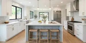
Two-Tone Kitchen Cabinets: Timeless or Trend? (2026)
For years, homeowners on Reddit’s r/kitchenremodel and r/DesignMyRoom have asked the same question:
“Are two-tone kitchen cabinets a timeless classic, or just a trendy style I’ll regret in a few years?”
As a kitchen designer with over 30 years of experience, here’s my answer: you might regret it—but only if you copy a photo blindly without thinking about your kitchen’s layout and color balance.
Most kitchens that age poorly ignore simple rules about proportions, contrast, and materials. The ones that stay beautiful for decades follow a few key design principles.
Before you decide on two-tone cabinets, let’s break down what works, what doesn’t, and how to make your kitchen look great for years to come.
Table of Contents
The Golden Formula Behind Every Successful Two-Tone Kitchen

One of the biggest mistakes homeowners make with two-tone cabinets is treating both colors equally.
At first glance, a 50/50 split may seem balanced. In reality, it often creates a visual divide that makes the kitchen feel disconnected. Instead of looking intentional, the space can feel like two different kitchens forced into one.
After designing kitchens for more than 30 years, I’ve found that the most successful two-tone kitchens follow a simple rule: 60-30-10.
This design principle helps create visual balance, gives the eye a clear focal point, and prevents the space from feeling busy or chaotic. Today, many professional designers still use this approach when planning modern two-tone kitchens.
| Design Element | Recommended Percentage | Typical Application | Why It Works |
| Primary Color | 60% | Walls, upper cabinets, or perimeter cabinetry | Keeps the kitchen bright and visually open |
| Secondary Color | 30% | Lower cabinets or kitchen island | Adds depth, contrast, and visual weight |
| Accent Color | 10% | Hardware, lighting, countertops, faucets, and décor | Connects the entire design together |
| Avoid This | 50% / 50% split | Equal dark and light cabinetry | Often creates a choppy, disconnected look |
Why 60-30-10 Works Better Than 50-50
Think about how your eyes move around a room.
When one color clearly dominates, your kitchen feels calm and organized. When two cabinet colors compete for equal attention, the room can feel visually fragmented. Many designers recommend making one color the “leader” and using the second color as a supporting accent rather than giving both equal visual weight.
The Easiest Formula to Follow
If you’re unsure where to start, this combination is hard to get wrong:
| Area | Color Direction |
| Upper Cabinets | White, Cream, Warm Greige |
| Lower Cabinets | Navy, Charcoal, Forest Green, Natural Wood |
| Hardware & Fixtures | Brass, Brushed Nickel, Matte Black |
| Countertops | White Quartz or Light Stone with subtle veining |
This approach keeps the upper half of the room light while giving the lower half a strong visual foundation. It also works particularly well in kitchens with standard 8- to 9-foot ceilings because lighter upper cabinets help the space feel taller and more open.
Designer Tip: If your two-tone kitchen feels unfinished, don’t immediately change the cabinet colors. First look at the countertop, hardware, and backsplash. In many cases, these elements act as the visual bridge that connects both cabinet colors into one cohesive design.
How to Use Two-Tone Cabinets in Different Kitchen Layouts
A two-tone kitchen can look timeless in one home and completely out of place in another.
The difference is usually not the colors. It’s the layout.
Before choosing cabinet colors, ask yourself one question:
Where do people naturally look when they enter the room?
The best two-tone kitchens use color to guide the eye, create balance, and reduce visual clutter. Here is the approach I recommend for the four most common kitchen layouts.
| Kitchen Layout | Common Mistake | Better Approach | Why It Works |
| Galley Kitchen | Using dark cabinets on both sides | Keep one side light and use wood or a darker tone on the opposite wall | Creates visual depth and reduces the tunnel-like feeling |
| L-Shaped Kitchen | Not knowing how to color the pantry wall | Match tall pantry cabinets and appliance towers with the lower cabinets | Creates a strong visual anchor and makes the layout feel intentional |
| U-Shaped Kitchen | Applying the same two-tone pattern on all three walls | Keep the main focal wall lighter and use two-tone only on the side walls | Prevents the room from feeling boxed in by dark cabinetry |
| Open Concept with Island | Using multiple accent colors throughout the room | Keep perimeter cabinets one color and use the island as the accent | Creates a clear focal point without visual competition |
1. Galley Kitchen: Reduce the Tunnel Effect

Galley kitchens are often narrow, with cabinets facing each other on both sides.
Many homeowners choose white upper cabinets and dark lower cabinets on both walls. While this sounds balanced, it can actually emphasize the long, narrow shape of the room.
A better solution is to keep one wall light and use a natural wood tone or darker color on the opposite side.
| Recommended Layout | Avoid |
| White cabinets on one side + walnut or navy cabinets on the other | Matching two-tone cabinets on both walls |
| Open shelving on one wall | Upper cabinets covering both sides |
This approach helps the kitchen feel wider and more open.
2. L-Shaped Kitchen: Let the Pantry Wall Do the Heavy Lifting
One of the most common questions homeowners ask is:
“Should my tall pantry cabinets match the upper cabinets or the lower cabinets?”
In most cases, tall pantry cabinets should match the lower cabinets.
Tall cabinets naturally carry more visual weight. When they share the same color as the base cabinets, they create a strong anchor wall that grounds the entire kitchen.
| Element | Recommended Color |
| Upper Cabinets | White, Cream, Warm Greige |
| Base Cabinets | Navy, Charcoal, Forest Green, Walnut |
| Tall Pantry Cabinets | Same color as base cabinets |
This simple choice often makes the kitchen feel more cohesive.
3. U-Shaped Kitchen: Avoid the Dark Cabinet Trap
U-shaped kitchens already surround you on three sides.
When homeowners repeat dark base cabinets around the entire room, the dark color can form a continuous band that feels heavy and overwhelming.
Instead, simplify the wall directly in front of you.
| Better Strategy | Why It Helps |
| Use one cabinet color on the main wall | Creates a cleaner focal point |
| Add open shelving | Reduces visual weight |
| Use two-tone only on side walls | Maintains contrast without overcrowding the space |
The goal is to give your eyes a place to rest.
4. Open Concept Kitchen with Island: Make the Island the Star
Open-concept kitchens are where two-tone cabinets work best.
Because the room is larger and more connected to surrounding living spaces, a contrasting island can create a focal point without making the kitchen feel busy.
| Perimeter Cabinets | Island |
| White | Navy Blue |
| Warm White | Walnut |
| Soft Greige | Charcoal |
| Light Oak | Deep Green |
If you’re unsure, keep all perimeter cabinets the same color and make the island your only accent color.
This is one of the safest and most timeless approaches designers use today.
Designer’s Advice
If you remember only one thing, remember this:
Don’t choose your two-tone cabinet layout based on a photo. Choose it based on your floor plan.
The most successful kitchens use color to support the architecture of the room, not compete with it. When the layout and color strategy work together, a two-tone kitchen can look beautiful for many years instead of feeling like a passing trend.
Pitfall Guide: Dark Base Cabinets Aren’t a “No-Clean Magic” Solution
Many homeowners choose dark lower cabinets thinking they hide dirt, stains, and scratches. But several Reddit users regret this choice after a few years. Let’s break down the main pitfalls and how to avoid them.
| Problem | Why It Happens | Designer Solution |
| Visible fingerprints, water spots, flour, and pet hair | Extreme dark colors like matte black, navy, or deep green hide scratches but make light debris highly visible | Use dark wood with natural grain (black walnut, smoked oak) or matte low-reflective finishes that mask fingerprints and spills |
| Cold, gloomy kitchen in low-light spaces | North-facing kitchens or poor lighting + cool dark colors (cool gray + navy) make the space feel icy | Balance dark cabinets with warm neutrals like cream, ivory, or light greige; consider warm LED lighting to offset the chill |
| Overuse of extreme contrasts | Dark base + very light upper cabinets without transition elements can feel disconnected | Use accent colors (hardware, countertop veining) to bridge dark and light tones and create visual cohesion |
Key Takeaways for Dark Base Cabinets
- Choose texture over pure color. Dark wood with natural grain hides fingerprints and minor scratches better than solid flat colors.
- Mind the light. If your kitchen lacks sunlight, warm colors on upper cabinets or walls prevent the space from feeling cold.
- Use accents as a bridge. Hardware, countertops, and backsplashes help connect light and dark colors, making the design intentional rather than harsh.
- Avoid extreme monochrome. A purely black base with pure white upper cabinets looks dramatic in photos but is high-maintenance in real life.
Designer Tip
Many homeowners think dark cabinets are “no-clean.” In reality, the right material and color balance will make cleaning easier without sacrificing aesthetics. Matte, textured wood or anti-fingerprint finishes give you both style and practicality, even in busy kitchens.
The Hidden Factor That Determines Whether Your Cabinets Last 5 Years or 25 Years
By now, we’ve talked about color balance, kitchen layouts, and common design mistakes.
But there is one factor many homeowners overlook:
The cabinet material matters just as much as the color.
In fact, some of the biggest regrets homeowners have years after a remodel are not about design at all.
The colors still look beautiful.
The problem is that the doors start cracking, the paint begins separating at the joints, or the cabinet boxes slowly warp over time.
This is especially important in a two-tone kitchen. Because contrasting colors naturally draw more attention, even small defects become easier to notice.
That’s why professional designers often focus on cabinet construction before choosing paint colors.
| Cabinet Component | Recommended Material | Why Designers Prefer It |
| Cabinet Boxes | Plywood | Stronger screw holding, better moisture resistance, less risk of warping |
| Painted Cabinet Doors | High-Quality MDF | Extremely smooth surface and greater paint stability |
| Natural Wood Doors | Solid Wood or Wood Veneer | Shows authentic wood grain and natural character |
| Large Kitchen Islands | Plywood Construction | Better support for heavy quartz or stone countertops |
Why Plywood Is Still the Preferred Choice for Cabinet Boxes
The cabinet box is the structural foundation of your kitchen.
It supports the weight of countertops, appliances, dishes, and daily use.
For lower cabinets and large islands, plywood remains one of the most trusted materials because it is made from multiple layers of wood veneer bonded together. This layered construction helps improve dimensional stability and moisture resistance compared with many particleboard alternatives.
If you’re investing in a large island with a heavy quartz countertop, this is one area where cutting costs rarely pays off.
Why MDF Often Performs Better Than Solid Wood for Painted Doors
Many homeowners assume solid wood is always the premium option.
For stained finishes, that is often true.
For painted cabinets, however, high-quality MDF frequently produces a smoother and more durable painted surface.
Solid wood naturally expands and contracts as temperature and humidity change throughout the year. Over time, this movement can make seams and joints more visible beneath painted finishes.
MDF is more uniform and stable, which helps reduce the risk of visible paint cracking, especially on white, cream, navy, and other painted two-tone cabinet designs.
The Best Material Combination for a Two-Tone Kitchen
If your goal is long-term durability and a clean painted finish, many designers recommend the following combination:
| Component | Recommended Material |
| Cabinet Box | Plywood |
| Painted Doors | Premium MDF |
| Shelving | Plywood |
| Large Island Structure | Plywood |
| Wood-Tone Accent Areas | Real Wood Veneer or Solid Wood |
This combination offers a balance of durability, moisture resistance, paint performance, and long-term value.
Designer’s Advice
When choosing two-tone cabinets, don’t spend all your time comparing colors.
A beautiful color combination can always be repainted in the future.
A poorly built cabinet is much harder and far more expensive to fix.
If your budget is limited, invest in the cabinet construction first, then choose the color palette. In the long run, the quality of the materials will have a much bigger impact on how your kitchen looks ten years from now.
Looking Ahead: The Softer and Smarter Future of Two-Tone Kitchens
If you’re worried about choosing the “wrong” cabinet color today, you’re not alone.
One of the biggest concerns homeowners have is simple:
“Will my kitchen still look good five or ten years from now?”
The good news is that kitchen design trends are becoming more practical and more forgiving.
Trend #1: From High Contrast to Natural Contrast
A few years ago, many two-tone kitchens relied on dramatic combinations like black and white or bright white and dark charcoal.
Today, designers are moving toward softer, nature-inspired color pairings that feel warmer and easier to live with.
| Popular Combinations for 2026 | Why Homeowners Like Them |
| Light Oatmeal + Sage Green | Soft, calming, and connected to nature |
| Natural Oak + Warm Greige | Timeless and easy to match with different styles |
| Cream White + Walnut | Warm contrast without feeling harsh |
| Soft Taupe + Deep Olive | Rich but still relaxed |
| Warm White + Light Wood | Bright, inviting, and unlikely to go out of style |
These combinations create contrast without making the kitchen feel busy. They also tend to age better because they are inspired by natural materials rather than short-term color trends.
Trend #2: Designing for Change
The smartest kitchens today are not designed to stay exactly the same forever.
They are designed to evolve.
Many homeowners are now choosing cabinet systems with standard-sized doors and modular components. This approach makes future updates much easier and more affordable.
For example, if you decide five years from now that you no longer love your island color, you may only need to replace the island doors instead of remodeling the entire kitchen.
| Traditional Approach | Future-Proof Approach |
| Replace entire kitchen for a new look | Replace selected doors or panels |
| Higher renovation costs | Lower update costs |
| Major disruption | Faster and simpler refresh |
| All-or-nothing redesign | Gradual style updates |
Designer’s Advice
Don’t try to predict the next trend.
Instead, choose colors and materials that feel comfortable in your home today.
Natural wood tones, warm neutrals, and flexible cabinet designs have something in common:
They don’t depend on trends to look good.
And that’s usually the difference between a kitchen that feels dated after a few years and one that still feels welcoming a decade later.
The most timeless two-tone kitchens are not the ones that follow every trend.
They’re the ones that leave room for change.
Final Thoughts: Let Design Serve Real Life
At the end of the day, most regrets about two-tone kitchens don’t come from color choice.
They come from ignoring layout, proportion, or material quality.
When these three things are done right, two-tone cabinets stop being a “trend” and become a long-term design choice that grows with your home.
The key is simple:
- Let the layout guide the colors
- Let proportion create balance
- Let materials support everyday use
If you follow these principles, a two-tone kitchen is not something you’ll regret.
It’s something you’ll enjoy more over time—and often, something that even helps your home feel more valuable when done well.
Because the best kitchens are not the ones that follow trends.
They are the ones that work quietly in the background of real life.


About author
Related posts
When people shop for new cabinet doors, they often focus on color, style, or finish first. That makes sense. But in real home projects, the... Continue reading
Painting bathroom cabinets is not the same as painting a dresser or a living room shelf. A bathroom is a humid space, which means the... Continue reading
Floating cabinets are beautiful. They make a space feel lighter, cleaner, and more refined. No bulky legs, no visual clutter — just a clean, modern... Continue reading

Cabinets take up a large part of any kitchen, bathroom, or laundry room. When the color no longer feels right, the whole space can start... Continue reading
Installing an undermount sink and cabinets might seem straightforward, but the truth is, proper installation is key to keeping your kitchen safe and functional for... Continue reading


Add comment